Prompt
Description
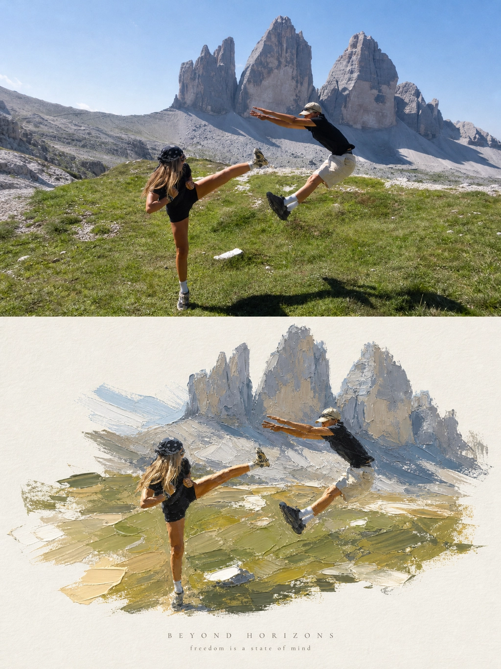
The thick oil painting of a landscape is mirrored on the poster, with the goal of creating a separate photography and design counterpart for each input photo, without photo merging. It is applicable to people, animals, plants, buildings, objects, and various scenes, expressed based on the original photo, without applying fixed themes. The painting size and layout use a 3:4 vertical painting canvas, with the top and bottom strictly divided, each taking up 50%. The top area is the photography zone, and the bottom area is the design zone; the two areas are directly connected, with clear boundaries, no gaps, gradations, or transformations. All design elements and text are embedded in the bottom area, without adding title areas. The photography zone retains the original photo's true photographic quality, subject identity and quantity, outline, posture, proportions, key details, transparency, position, natural light, and original colors, with only slight advanced color grading. It can cut out key environments or slightly expand the background, but cannot cut out the subject, stretch, distort, mirror, copy, move, or redraw the subject. The photography zone does not add text, borders, paper texture, or decorations. The design zone extracts the subject, outline, posture, and spatial relationships from the same photo, reconstructing a thick oil painting of a landscape with a sculptural sense. It expresses the layered painting, brushstrokes, hand-shaping, and undulating edges, without mechanically replicating photographic details. The subject is in the center or slightly biased, leaving a large area of warm white paper blank; a stroke from the original photo can support the subject, which can be transformed into a ground, water surface, path, or abstract space slice. A small amount of reflection, light spots, rain fog, or extended brushstrokes can be retained, but no unrelated elements are added. Color matching and materials Extract the main color, secondary colors, and temperature relationships from the original image to form a limited color palette that is harmonious, prioritizing the subject's color personality without applying fixed color schemes. This approach enhances the design's luminosity and transparency. The color palette focuses on accent colors, environmental slices, and highlights, while maintaining the subject's refined structure. The paper presents a delicate texture and matte finish, avoiding a plastic feel. The text is placed in the design area with a short English title, accompanied by a line of small subheadings; a minimal number of numbers or micro-annotations can be added when necessary. The font is slim and restrained, often used along the main axis or in white space. The text should be generated based on the confirmed subject or emotion, with correct spelling. When there is no reliable information, no place names, dates, coordinates, brands, signatures, accounts, or placeholder symbols should be added. The temperament is quiet, restrained, and refined, possessing the order and collectible quality of art publications, with layers built through material, white space, volume, and subject relationships. Avoid mixing different photos, changing the subject, unrelated scenes, illustration in the photography area, cluttered decorations, extra title bars, random text, logos, signatures, watermarks, cartoons, high-saturation color clashes, grayish color matching, fluorescent colors, candy filters, smooth plastic 3D, cheap CG, and complex scenes.
The Prompt
The thick oil painting of a landscape is mirrored on the poster, with the goal of creating a separate photography and design counterpart for each input photo, without photo merging. It is applicable to people, animals, plants, buildings, objects, and various scenes, expressed based on the original photo, without applying fixed themes. The painting size and layout use a 3:4 vertical painting canvas, with the top and bottom strictly divided, each taking up 50%. The top area is the photography zone, and the bottom area is the design zone; the two areas are directly connected, with clear boundaries, no gaps, gradations, or transformations. All design elements and text are embedded in the bottom area, without adding title areas. The photography zone retains the original photo's true photographic quality, subject identity and quantity, outline, posture, proportions, key details, transparency, position, natural light, and original colors, with only slight advanced color grading. It can cut out key environments or slightly expand the background, but cannot cut out the subject, stretch, distort, mirror, copy, move, or redraw the subject. The photography zone does not add text, borders, paper texture, or decorations. The design zone extracts the subject, outline, posture, and spatial relationships from the same photo, reconstructing a thick oil painting of a landscape with a sculptural sense. It expresses the layered painting, brushstrokes, hand-shaping, and undulating edges, without mechanically replicating photographic details. The subject is in the center or slightly biased, leaving a large area of warm white paper blank; a stroke from the original photo can support the subject, which can be transformed into a ground, water surface, path, or abstract space slice. A small amount of reflection, light spots, rain fog, or extended brushstrokes can be retained, but no unrelated elements are added. Color matching and materials Extract the main color, secondary colors, and temperature relationships from the original image to form a limited color palette that is harmonious, prioritizing the subject's color personality without applying fixed color schemes. This approach enhances the design's luminosity and transparency. The color palette focuses on accent colors, environmental slices, and highlights, while maintaining the subject's refined structure. The paper presents a delicate texture and matte finish, avoiding a plastic feel. The text is placed in the design area with a short English title, accompanied by a line of small subheadings; a minimal number of numbers or micro-annotations can be added when necessary. The font is slim and restrained, often used along the main axis or in white space. The text should be generated based on the confirmed subject or emotion, with correct spelling. When there is no reliable information, no place names, dates, coordinates, brands, signatures, accounts, or placeholder symbols should be added. The temperament is quiet, restrained, and refined, possessing the order and collectible quality of art publications, with layers built through material, white space, volume, and subject relationships. Avoid mixing different photos, changing the subject, unrelated scenes, illustration in the photography area, cluttered decorations, extra title bars, random text, logos, signatures, watermarks, cartoons, high-saturation color clashes, grayish color matching, fluorescent colors, candy filters, smooth plastic 3D, cheap CG, and complex scenes.